This report serves to describe the mutational landscape and properties of a given individual set, as well as rank genes and genesets according to mutational significance. MutSigCV v0.9 was used to generate the results found in this report.
-
Working with individual set: COADREAD-TP
-
Number of patients in set: 489
The input for this pipeline is a set of individuals with the following files associated for each:
-
An annotated .maf file describing the mutations called for the respective individual, and their properties.
-
A .wig file that contains information about the coverage of the sample.
-
MAF used for this analysis:COADREAD-TP.final_analysis_set.maf
-
Blacklist used for this analysis: pancan_mutation_blacklist.v14.hg19.txt
-
Significantly mutated genes (q ≤ 0.1): 131
The x axis represents the samples. The y axis represents the exons, one row per exon, and they are sorted by average coverage across samples. For exons with exactly the same average coverage, they are sorted next by the %GC of the exon. (The secondary sort is especially useful for the zero-coverage exons at the bottom). If the figure is unpopulated, then full coverage is assumed (e.g. MutSig CV doesn't use WIGs and assumes full coverage).
Figure 1.
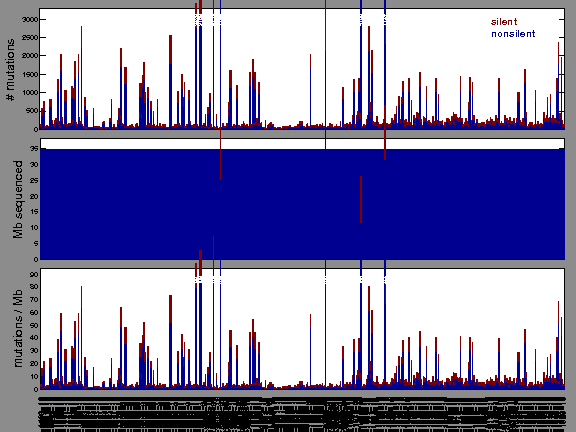
Figure 2. Patients counts and rates file used to generate this plot: COADREAD-TP.patients.counts_and_rates.txt
The mutation spectrum is depicted in the lego plots below in which the 96 possible mutation types are subdivided into six large blocks, color-coded to reflect the base substitution type. Each large block is further subdivided into the 16 possible pairs of 5' and 3' neighbors, as listed in the 4x4 trinucleotide context legend. The height of each block corresponds to the mutation frequency for that kind of mutation (counts of mutations normalized by the base coverage in a given bin). The shape of the spectrum is a signature for dominant mutational mechanisms in different tumor types.
Figure 3. Get High-res Image SNV Mutation rate lego plot for entire set. Each bin is normalized by base coverage for that bin. Colors represent the six SNV types on the upper right. The three-base context for each mutation is labeled in the 4x4 legend on the lower right. The fractional breakdown of SNV counts is shown in the pie chart on the upper left. If this figure is blank, not enough information was provided in the MAF to generate it.
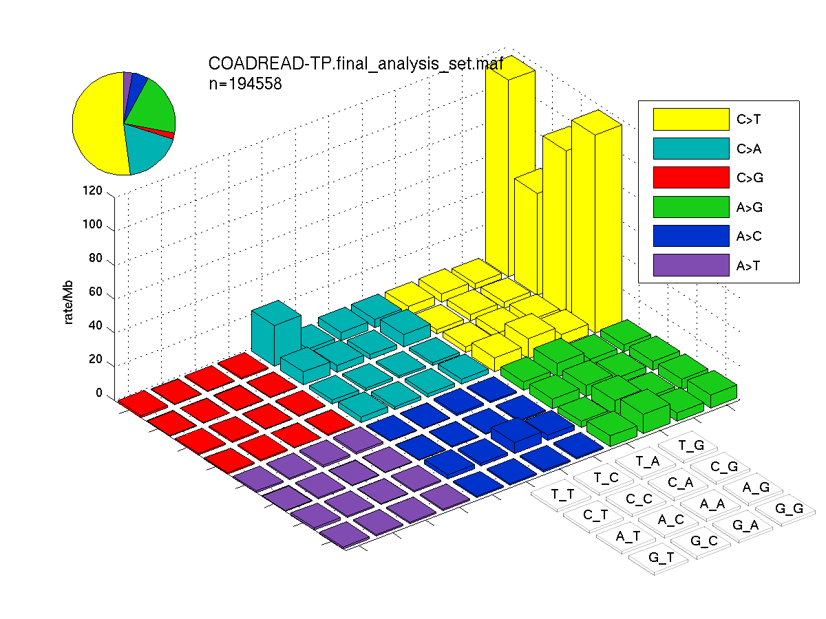
Figure 4. Get High-res Image SNV Mutation rate lego plots for 4 slices of mutation allele fraction (0<=AF<0.1, 0.1<=AF<0.25, 0.25<=AF<0.5, & 0.5<=AF) . The color code and three-base context legends are the same as the previous figure. If this figure is blank, not enough information was provided in the MAF to generate it.

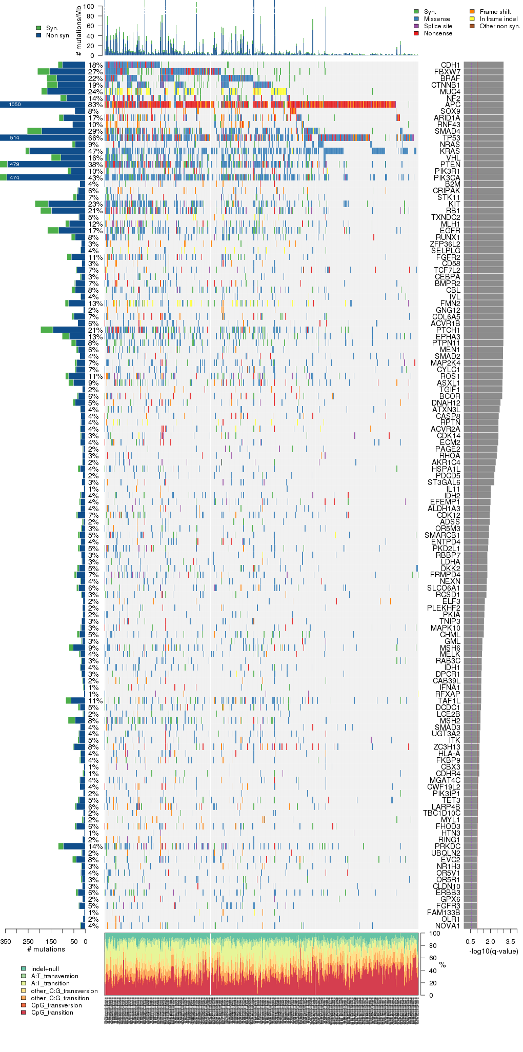
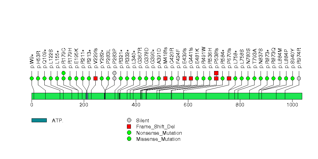
Figure 5. Get High-res Image The matrix in the center of the figure represents individual mutations in patient samples, color-coded by type of mutation, for the significantly mutated genes. The rate of synonymous and non-synonymous mutations is displayed at the top of the matrix. The barplot on the left of the matrix shows the number of mutations in each gene. The percentages represent the fraction of tumors with at least one mutation in the specified gene. The barplot to the right of the matrix displays the q-values for the most significantly mutated genes. The purple boxplots below the matrix (only displayed if required columns are present in the provided MAF) represent the distributions of allelic fractions observed in each sample. The plot at the bottom represents the base substitution distribution of individual samples, using the same categories that were used to calculate significance.
Column Descriptions:
-
nnon = number of (nonsilent) mutations in this gene across the individual set
-
npat = number of patients (individuals) with at least one nonsilent mutation
-
nsite = number of unique sites having a non-silent mutation
-
nflank = number of noncoding mutations from this gene's flanking region, across the individual set
-
nsil = number of silent mutations in this gene across the individual set
-
p = p-value (overall)
-
q = q-value, False Discovery Rate (Benjamini-Hochberg procedure)
Table 1. Get Full Table A Ranked List of Significantly Mutated Genes. Number of significant genes found: 131. Number of genes displayed: 35. Click on a gene name to display its stick figure depicting the distribution of mutations and mutation types across the chosen gene (this feature may not be available for all significant genes).
| gene | Nnon | Nsil | Nflank | nnon | npat | nsite | nsil | nflank | nnei | fMLE | p | score | time | q |
|---|---|---|---|---|---|---|---|---|---|---|---|---|---|---|
| CDH1 | 955506 | 284109 | 6920 | 100 | 86 | 72 | 19 | 0 | 20 | 1.4 | 0 | 260 | 0.75 | 0 |
| FBXW7 | 949638 | 260637 | 4780 | 156 | 130 | 91 | 53 | 3 | 20 | 2.7 | 0 | 380 | 1.1 | 0 |
| BRAF | 844503 | 241077 | 6780 | 125 | 109 | 55 | 43 | 0 | 19 | 1.7 | 6.7e-16 | 280 | 0.63 | 3e-12 |
| CTNNB1 | 899271 | 268950 | 5640 | 121 | 93 | 72 | 46 | 0 | 20 | 1.7 | 6.7e-16 | 260 | 2.7 | 3e-12 |
| MUC4 | 2225928 | 721764 | 8040 | 167 | 119 | 67 | 25 | 0 | 2 | 1.8 | 8.9e-16 | 490 | 1 | 3e-12 |
| NF2 | 626409 | 157947 | 5600 | 82 | 67 | 62 | 27 | 0 | 20 | 0.97 | 1e-15 | 240 | 1.4 | 3e-12 |
| APC | 3262608 | 914430 | 5820 | 858 | 404 | 436 | 192 | 0 | 4 | 8.7 | 1.4e-15 | 1400 | 3.2 | 3.3e-12 |
| SOX9 | 460638 | 135453 | 1040 | 46 | 41 | 43 | 0 | 0 | 20 | 1.2 | 1.4e-15 | 210 | 0.49 | 3.3e-12 |
| ARID1A | 2184363 | 643524 | 7520 | 96 | 83 | 73 | 19 | 0 | 2 | 1.2 | 3.2e-15 | 280 | 0.56 | 6.2e-12 |
| RNF43 | 814185 | 257703 | 3500 | 56 | 47 | 28 | 2 | 0 | 8 | 0.77 | 3.9e-15 | 200 | 0.92 | 6.2e-12 |
| SMAD4 | 647436 | 180441 | 4440 | 191 | 144 | 120 | 63 | 0 | 20 | 2.2 | 3.9e-15 | 400 | 0.97 | 6.2e-12 |
| TP53 | 462105 | 134964 | 4120 | 446 | 323 | 226 | 68 | 0 | 4 | 7.8 | 4.1e-15 | 920 | 0.71 | 6.2e-12 |
| NRAS | 225429 | 59658 | 1640 | 45 | 44 | 17 | 12 | 0 | 20 | 1.3 | 5.3e-15 | 140 | 0.86 | 7.1e-12 |
| KRAS | 295845 | 72372 | 2120 | 245 | 231 | 40 | 17 | 5 | 1 | 6.6 | 5.4e-15 | 520 | 0.68 | 7.1e-12 |
| VHL | 147678 | 46455 | 880 | 107 | 80 | 69 | 42 | 0 | 13 | 2.4 | 6.1e-15 | 250 | 1.6 | 7.1e-12 |
| PTEN | 476286 | 114426 | 3480 | 341 | 187 | 213 | 138 | 0 | 20 | 3.8 | 6.2e-15 | 510 | 1.1 | 7.1e-12 |
| PIK3R1 | 911496 | 234231 | 6900 | 63 | 51 | 41 | 13 | 1 | 20 | 1.5 | 7.2e-15 | 160 | 0.69 | 7.3e-12 |
| PIK3CA | 1270911 | 325185 | 7920 | 344 | 212 | 165 | 130 | 0 | 20 | 3.1 | 8e-15 | 450 | 1.1 | 7.3e-12 |
| B2M | 140343 | 39120 | 1280 | 24 | 18 | 18 | 1 | 0 | 20 | 0.63 | 8.4e-15 | 86 | 0.65 | 7.3e-12 |
| CRIPAK | 481176 | 159903 | 460 | 31 | 29 | 17 | 3 | 0 | 20 | 0.89 | 8.7e-15 | 130 | 1.1 | 7.3e-12 |
| STK11 | 243522 | 70416 | 940 | 38 | 34 | 26 | 15 | 0 | 20 | 1.1 | 8.9e-15 | 120 | 0.62 | 7.3e-12 |
| KIT | 1153062 | 312960 | 8380 | 162 | 112 | 121 | 58 | 0 | 20 | 2.1 | 9.5e-15 | 240 | 0.92 | 7.3e-12 |
| RB1 | 1392672 | 367239 | 9720 | 148 | 102 | 93 | 48 | 0 | 20 | 1.4 | 9.5e-15 | 290 | 1.1 | 7.3e-12 |
| TXNDC2 | 632766 | 176529 | 780 | 27 | 24 | 10 | 2 | 0 | 20 | 0.89 | 9.5e-15 | 120 | 2.1 | 7.3e-12 |
| MLH1 | 1164798 | 329097 | 7680 | 70 | 59 | 49 | 17 | 0 | 20 | 1.2 | 1.2e-14 | 200 | 0.64 | 8.8e-12 |
| EGFR | 1506120 | 411738 | 11760 | 116 | 84 | 98 | 49 | 0 | 20 | 1.3 | 2e-14 | 190 | 0.5 | 1.4e-11 |
| RUNX1 | 376041 | 117849 | 3900 | 45 | 41 | 31 | 16 | 0 | 13 | 1.4 | 9.5e-13 | 110 | 0.56 | 6.4e-10 |
| ZFP36L2 | 247434 | 79707 | 320 | 17 | 17 | 14 | 1 | 0 | 20 | 1.2 | 1.5e-12 | 95 | 3 | 9.9e-10 |
| SELPLG | 421029 | 151590 | 620 | 20 | 19 | 11 | 2 | 0 | 20 | 0.82 | 9e-12 | 90 | 0.94 | 5.7e-09 |
| FGFR2 | 1022010 | 286065 | 10260 | 61 | 53 | 50 | 19 | 0 | 18 | 1.3 | 4.1e-11 | 140 | 2.2 | 2.5e-08 |
| CD58 | 264060 | 67971 | 1800 | 16 | 15 | 14 | 0 | 0 | 20 | 0.54 | 7e-11 | 64 | 0.61 | 4.1e-08 |
| TCF7L2 | 726165 | 204891 | 5460 | 37 | 34 | 30 | 5 | 11 | 20 | 1.4 | 8.6e-11 | 120 | 0.64 | 4.9e-08 |
| CEBPA | 86553 | 26406 | 80 | 17 | 17 | 14 | 5 | 0 | 20 | 1.1 | 3.6e-10 | 58 | 2.4 | 2e-07 |
| BMPR2 | 1197561 | 343767 | 5200 | 43 | 36 | 40 | 4 | 0 | 20 | 0.94 | 9.5e-10 | 120 | 1.1 | 5.1e-07 |
| CBL | 975066 | 288021 | 6020 | 45 | 39 | 40 | 15 | 0 | 20 | 0.84 | 1.6e-09 | 110 | 2.1 | 8.4e-07 |
Figure S1. This figure depicts the distribution of mutations and mutation types across the CDH1 significant gene.
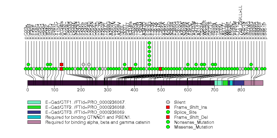
Figure S2. This figure depicts the distribution of mutations and mutation types across the FBXW7 significant gene.
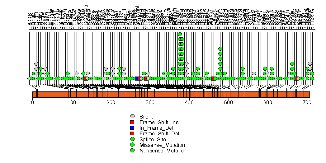
Figure S3. This figure depicts the distribution of mutations and mutation types across the BRAF significant gene.
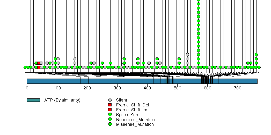
Figure S4. This figure depicts the distribution of mutations and mutation types across the CTNNB1 significant gene.
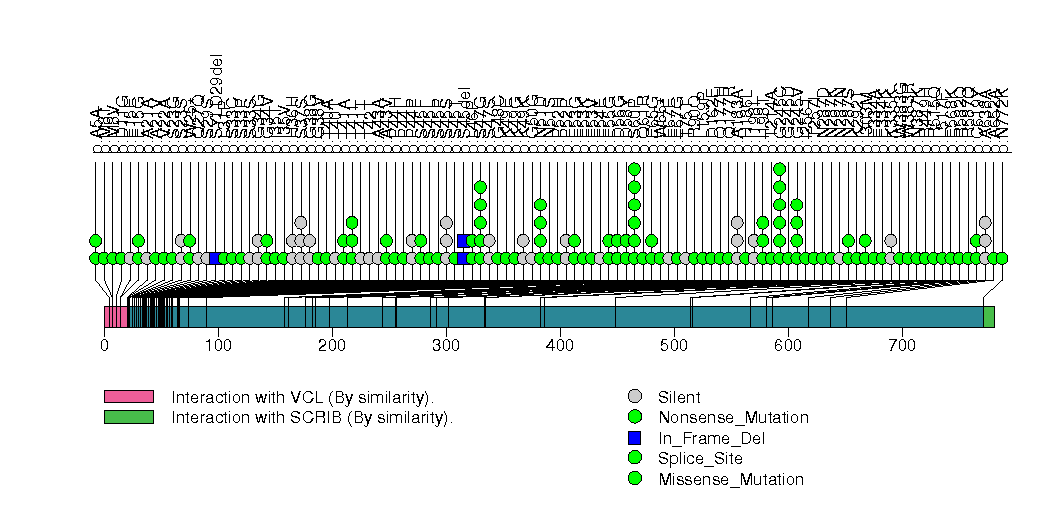
Figure S5. This figure depicts the distribution of mutations and mutation types across the MUC4 significant gene.
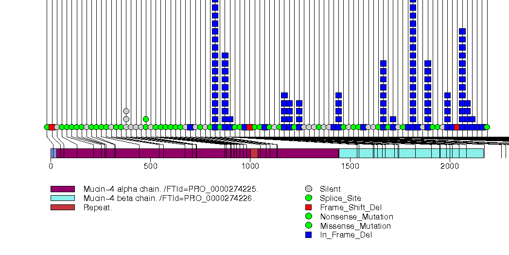
Figure S6. This figure depicts the distribution of mutations and mutation types across the NF2 significant gene.
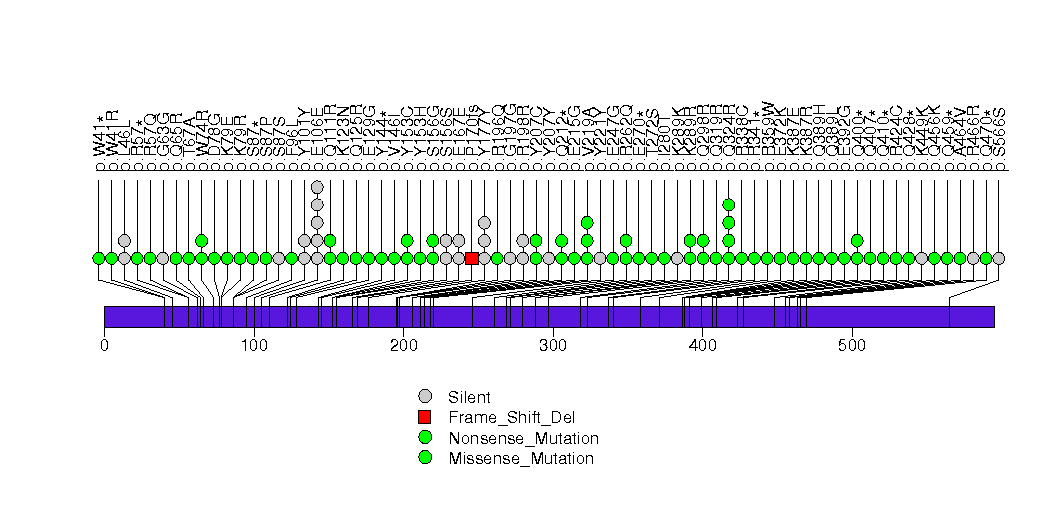
Figure S7. This figure depicts the distribution of mutations and mutation types across the APC significant gene.
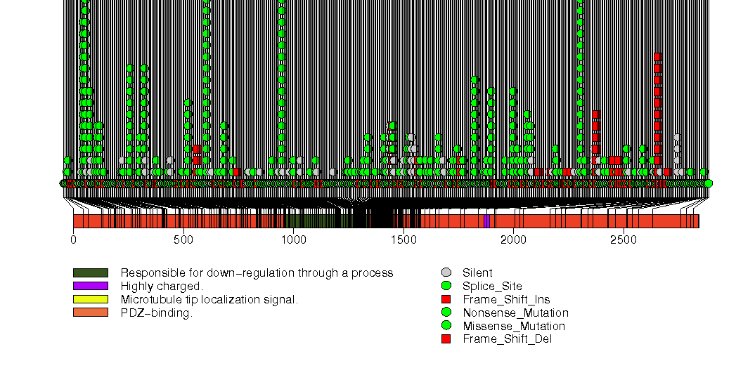
Figure S8. This figure depicts the distribution of mutations and mutation types across the SOX9 significant gene.
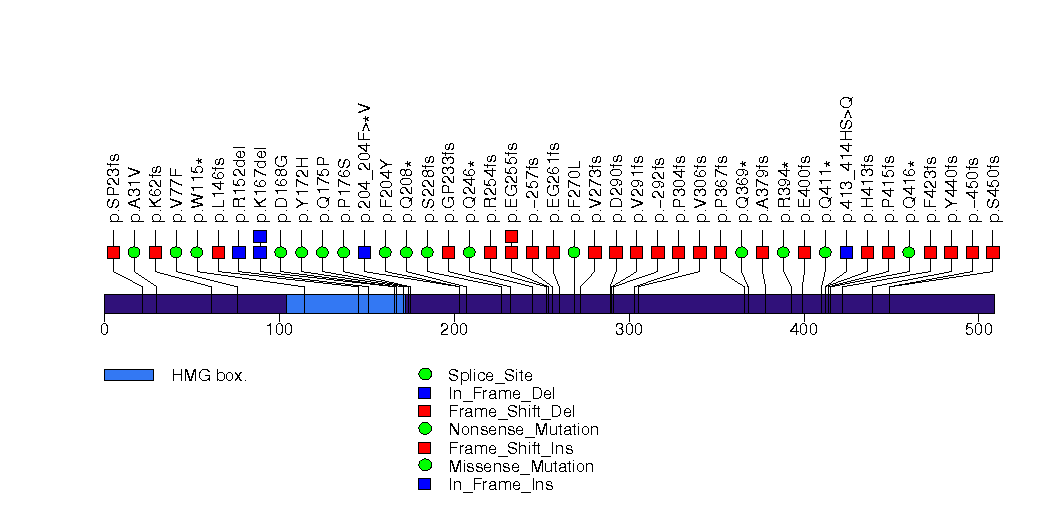
Figure S9. This figure depicts the distribution of mutations and mutation types across the ARID1A significant gene.
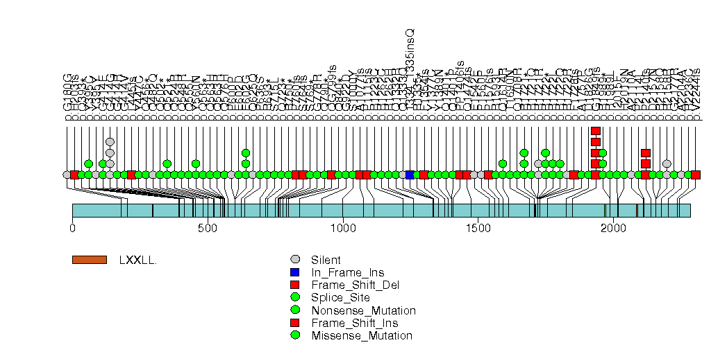
Figure S10. This figure depicts the distribution of mutations and mutation types across the RNF43 significant gene.
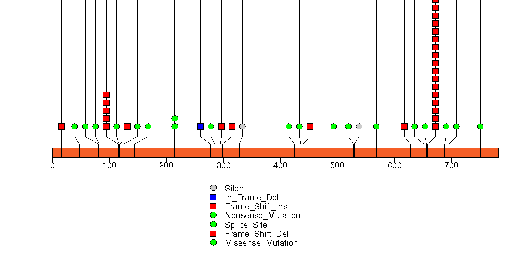
Figure S11. This figure depicts the distribution of mutations and mutation types across the SMAD4 significant gene.
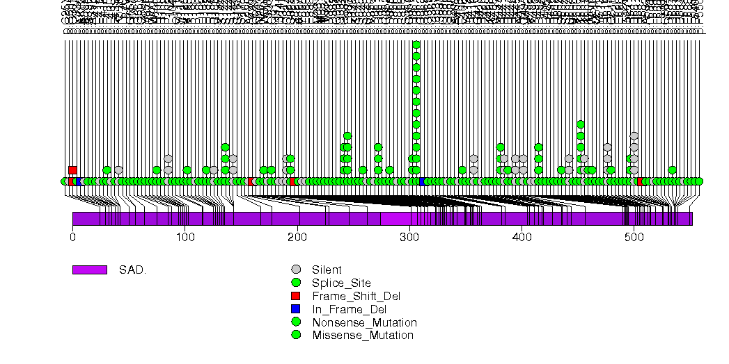
Figure S12. This figure depicts the distribution of mutations and mutation types across the TP53 significant gene.
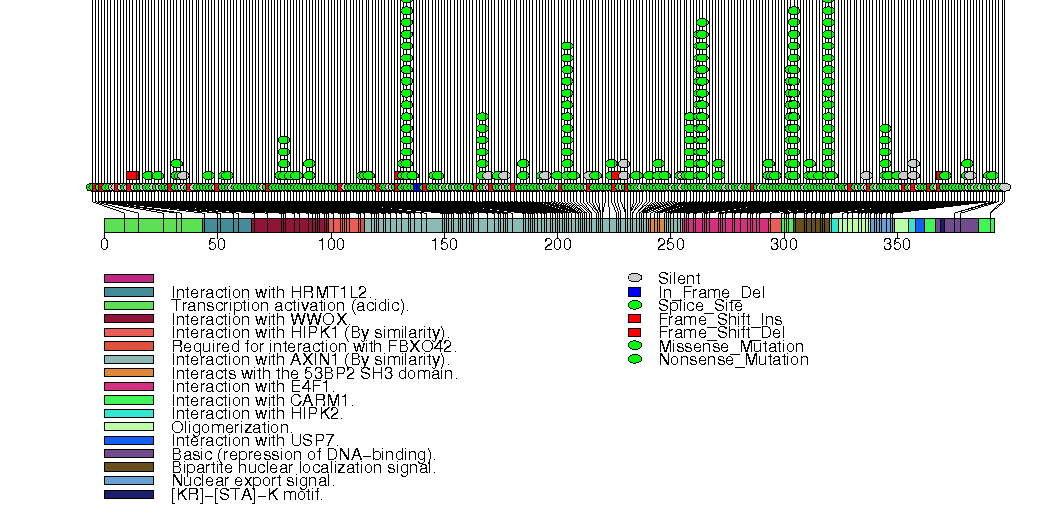
Figure S13. This figure depicts the distribution of mutations and mutation types across the NRAS significant gene.
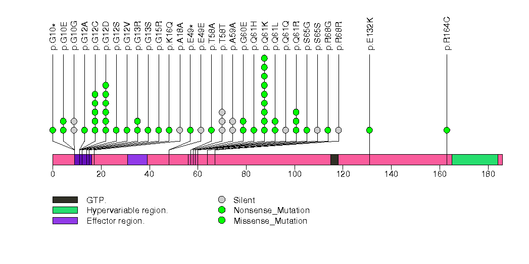
Figure S14. This figure depicts the distribution of mutations and mutation types across the KRAS significant gene.
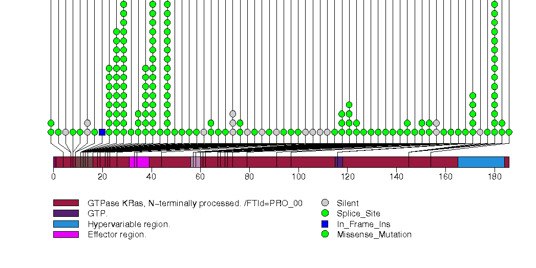
Figure S15. This figure depicts the distribution of mutations and mutation types across the VHL significant gene.
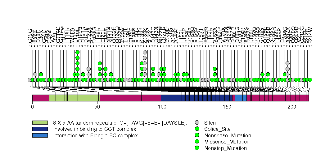
Figure S16. This figure depicts the distribution of mutations and mutation types across the PTEN significant gene.
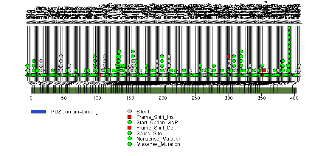
Figure S17. This figure depicts the distribution of mutations and mutation types across the PIK3R1 significant gene.
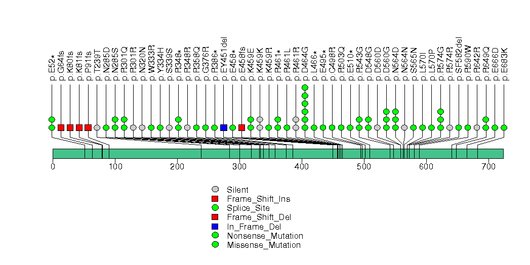
Figure S18. This figure depicts the distribution of mutations and mutation types across the PIK3CA significant gene.
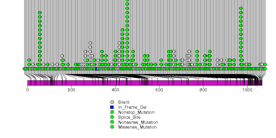
Figure S19. This figure depicts the distribution of mutations and mutation types across the B2M significant gene.
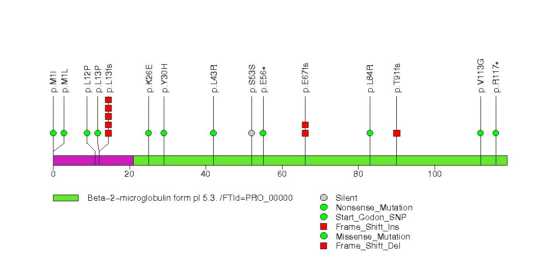
Figure S20. This figure depicts the distribution of mutations and mutation types across the CRIPAK significant gene.
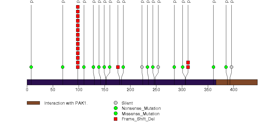
Figure S21. This figure depicts the distribution of mutations and mutation types across the STK11 significant gene.
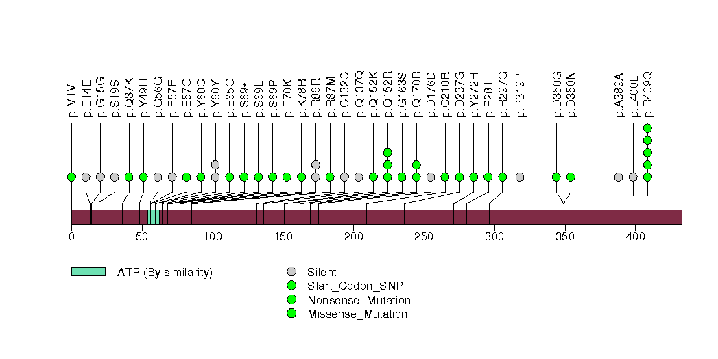
Figure S22. This figure depicts the distribution of mutations and mutation types across the KIT significant gene.
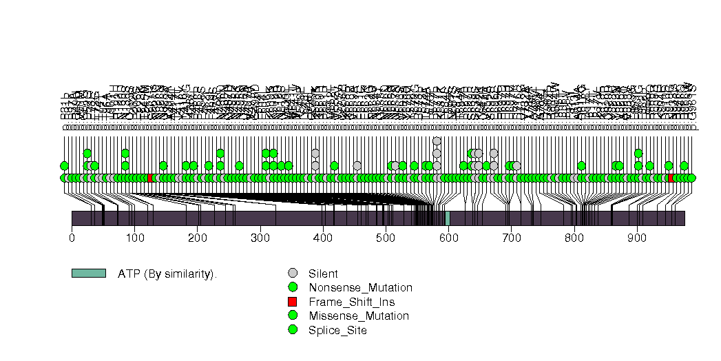
Figure S23. This figure depicts the distribution of mutations and mutation types across the RB1 significant gene.
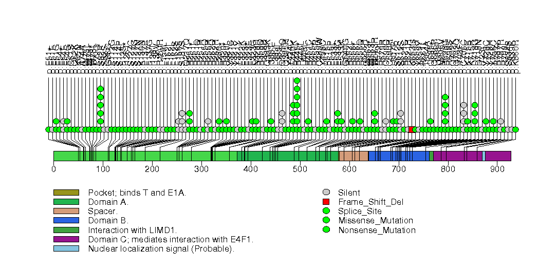
Figure S24. This figure depicts the distribution of mutations and mutation types across the TXNDC2 significant gene.
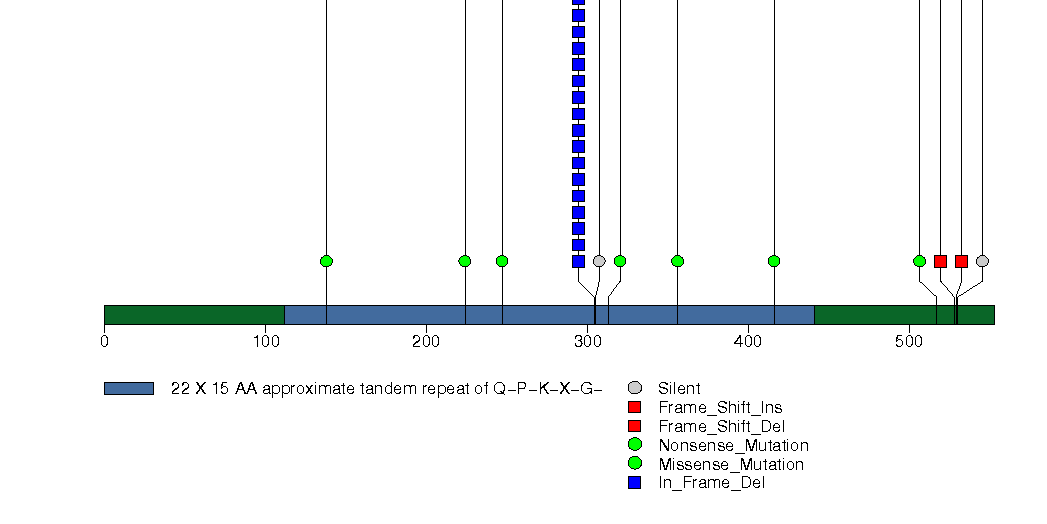
Figure S25. This figure depicts the distribution of mutations and mutation types across the MLH1 significant gene.
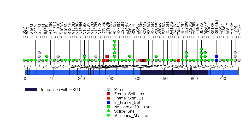
Figure S26. This figure depicts the distribution of mutations and mutation types across the EGFR significant gene.
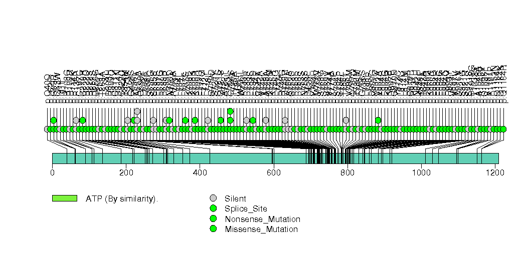
Figure S27. This figure depicts the distribution of mutations and mutation types across the RUNX1 significant gene.
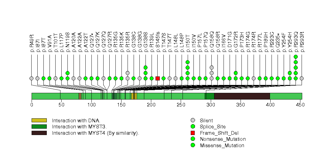
Figure S28. This figure depicts the distribution of mutations and mutation types across the ZFP36L2 significant gene.
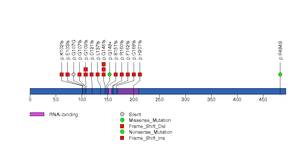
Figure S29. This figure depicts the distribution of mutations and mutation types across the SELPLG significant gene.
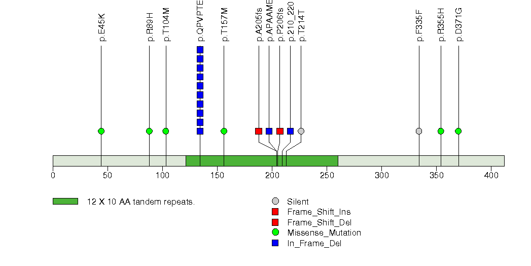
Figure S30. This figure depicts the distribution of mutations and mutation types across the FGFR2 significant gene.
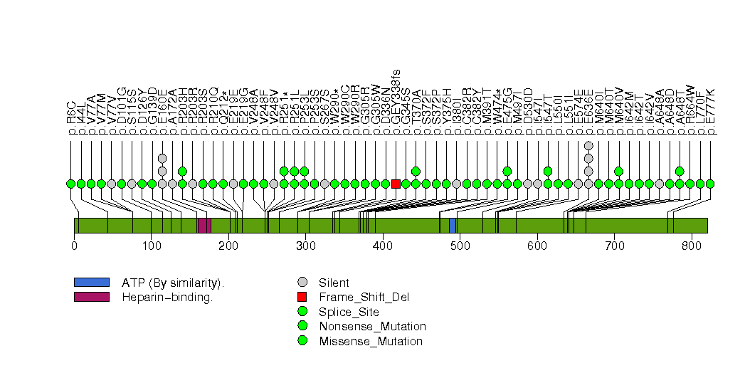
Figure S31. This figure depicts the distribution of mutations and mutation types across the CD58 significant gene.
Figure S32. This figure depicts the distribution of mutations and mutation types across the TCF7L2 significant gene.
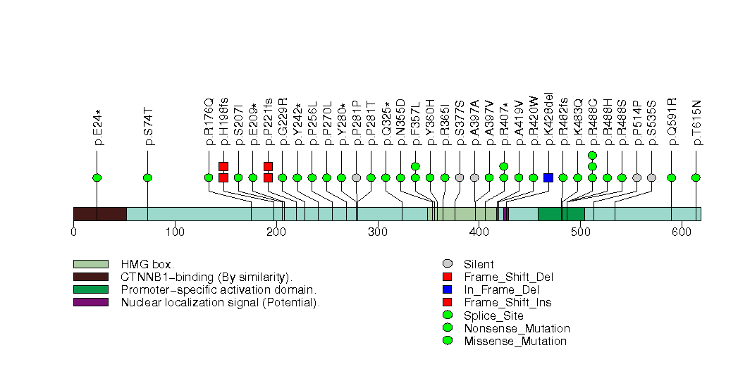
Figure S33. This figure depicts the distribution of mutations and mutation types across the CEBPA significant gene.
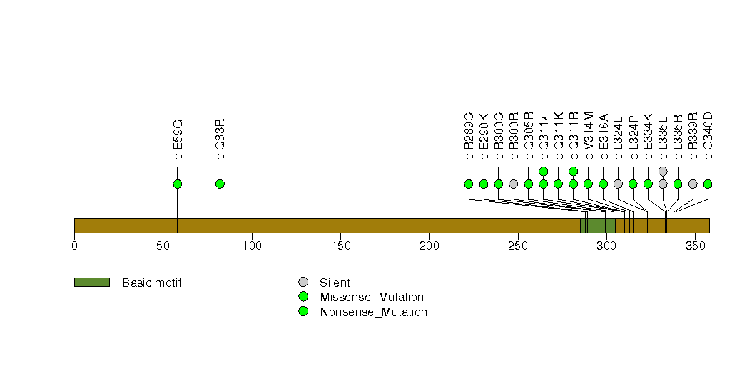
Figure S34. This figure depicts the distribution of mutations and mutation types across the BMPR2 significant gene.
In brief, we tabulate the number of mutations and the number of covered bases for each gene. The counts are broken down by mutation context category: four context categories that are discovered by MutSig, and one for indel and 'null' mutations, which include indels, nonsense mutations, splice-site mutations, and non-stop (read-through) mutations. For each gene, we calculate the probability of seeing the observed constellation of mutations, i.e. the product P1 x P2 x ... x Pm, or a more extreme one, given the background mutation rates calculated across the dataset. [1]
In addition to the links below, the full results of the analysis summarized in this report can also be downloaded programmatically using firehose_get, or interactively from either the Broad GDAC website or TCGA Data Coordination Center Portal.