Broad Institute GDAC Firehose Analyses Workflow Graph
Last Updated: 2015_05_07
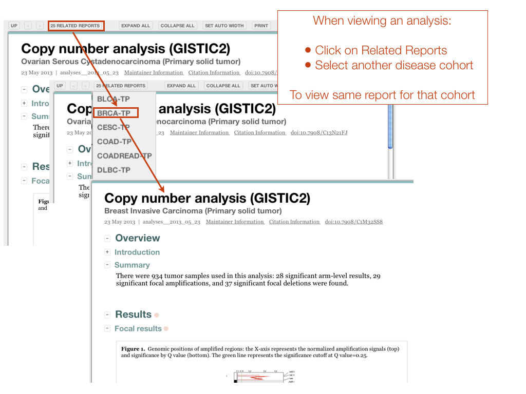
Below is a pictorial representation of the workflow Firehose executes upon each disease cohort in our standard Analyses runs. Clicking on a shaded rectangular node in this graph will bring you to the respective Nozzle report for that analysis task. From that report you can also use the Related Reports feature to view the results of the same analysis task executed on different disease cohorts. The pentagonal nodes encapsulate nested workflows–-clicking on them will bring you to the workflow graph for that particular subworkflow. This page was constructed with the help of GraphViz and PyDOT.

Copyright (c) 2011-2014
Broad Institute of MIT & Harvard. Downloading data from this site constitutes agreement to
TCGA data usage policy.
This page generated on:
Tue Nov 22 09:21:16 EST 2016