This report serves to describe the mutational landscape and properties of a given individual set, as well as rank genes and genesets according to mutational significance. MutSigCV v0.6 was used to generate the results found in this report.
-
Working with individual set: GBM-TP
-
Number of patients in set: 291
The input for this pipeline is a set of individuals with the following files associated for each:
-
An annotated .maf file describing the mutations called for the respective individual, and their properties.
-
A .wig file that contains information about the coverage of the sample.
-
MAF used for this analysis:GBM-TP.final_analysis_set.maf
-
Significantly mutated genes (q ≤ 0.1): 17
The x axis represents the samples. The y axis represents the exons, one row per exon, and they are sorted by average coverage across samples. For exons with exactly the same average coverage, they are sorted next by the %GC of the exon. (The secondary sort is especially useful for the zero-coverage exons at the bottom).
Figure 1.
Figure 2. Patients counts and rates file used to generate this plot: GBM-TP.patients.counts_and_rates.txt
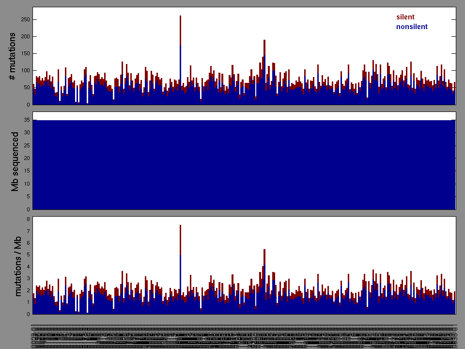
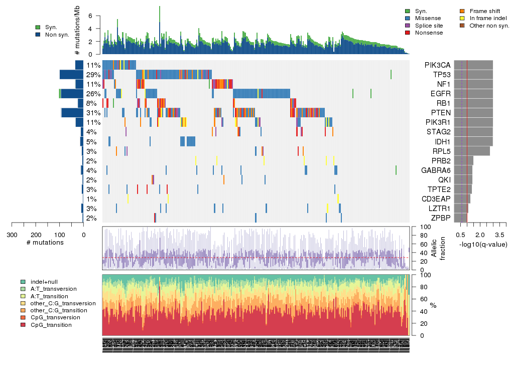
Figure 3. Get High-res Image The matrix in the center of the figure represents individual mutations in patient samples, color-coded by type of mutation, for the significantly mutated genes. The rate of synonymous and non-synonymous mutations is displayed at the top of the matrix. The barplot on the left of the matrix shows the number of mutations in each gene. The percentages represent the fraction of tumors with at least one mutation in the specified gene. The barplot to the right of the matrix displays the q-values for the most significantly mutated genes. The purple boxplots below the matrix (only displayed if required columns are present in the provided MAF) represent the distributions of allelic fractions observed in each sample. The plot at the bottom represents the base substitution distribution of individual samples, using the same categories that were used to calculate significance.
Column Descriptions:
-
nnon = number of (nonsilent) mutations in this gene across the individual set
-
npat = number of patients (individuals) with at least one nonsilent mutation
-
nsite = number of unique sites having a non-silent mutation
-
nflank = number of noncoding mutations from this gene's flanking region, across the individual set
-
nsil = number of silent mutations in this gene across the individual set
-
p = p-value (overall)
-
q = q-value, False Discovery Rate (Benjamini-Hochberg procedure)
Table 1. Get Full Table A Ranked List of Significantly Mutated Genes. Number of significant genes found: 17. Number of genes displayed: 35. Click on a gene name to display its stick figure depicting the distribution of mutations and mutation types across the chosen gene (this feature may not be available for all significant genes).
| gene | Nnon | Nsil | Nflank | nnon | npat | nsite | nsil | nflank | nnei | fMLE | p | score | time | q |
|---|---|---|---|---|---|---|---|---|---|---|---|---|---|---|
| PIK3CA | 756309 | 193515 | 0 | 35 | 32 | 28 | 0 | 0 | 20 | 0.96 | 2.7e-15 | 100 | 0.27 | 1.6e-11 |
| TP53 | 274995 | 80316 | 0 | 100 | 83 | 61 | 1 | 0 | 4 | 1 | 3.7e-15 | 280 | 0.27 | 1.6e-11 |
| NF1 | 2738892 | 767658 | 0 | 34 | 32 | 33 | 1 | 0 | 0 | 0.5 | 3.9e-15 | 160 | 0.27 | 1.6e-11 |
| EGFR | 896280 | 245022 | 0 | 95 | 77 | 45 | 7 | 0 | 20 | 1.5 | 4.1e-15 | 200 | 0.28 | 1.6e-11 |
| RB1 | 828768 | 218541 | 0 | 24 | 24 | 22 | 1 | 0 | 20 | 0.78 | 4.3e-15 | 140 | 0.27 | 1.6e-11 |
| PTEN | 283434 | 68094 | 0 | 93 | 90 | 75 | 0 | 0 | 20 | 0.43 | 5.3e-15 | 430 | 0.28 | 1.6e-11 |
| PIK3R1 | 542424 | 139389 | 0 | 34 | 33 | 28 | 0 | 0 | 20 | 1 | 6.7e-15 | 150 | 0.28 | 1.7e-11 |
| STAG2 | 909375 | 225816 | 0 | 12 | 12 | 12 | 0 | 0 | 20 | 0.69 | 1.1e-08 | 63 | 0.27 | 0.000023 |
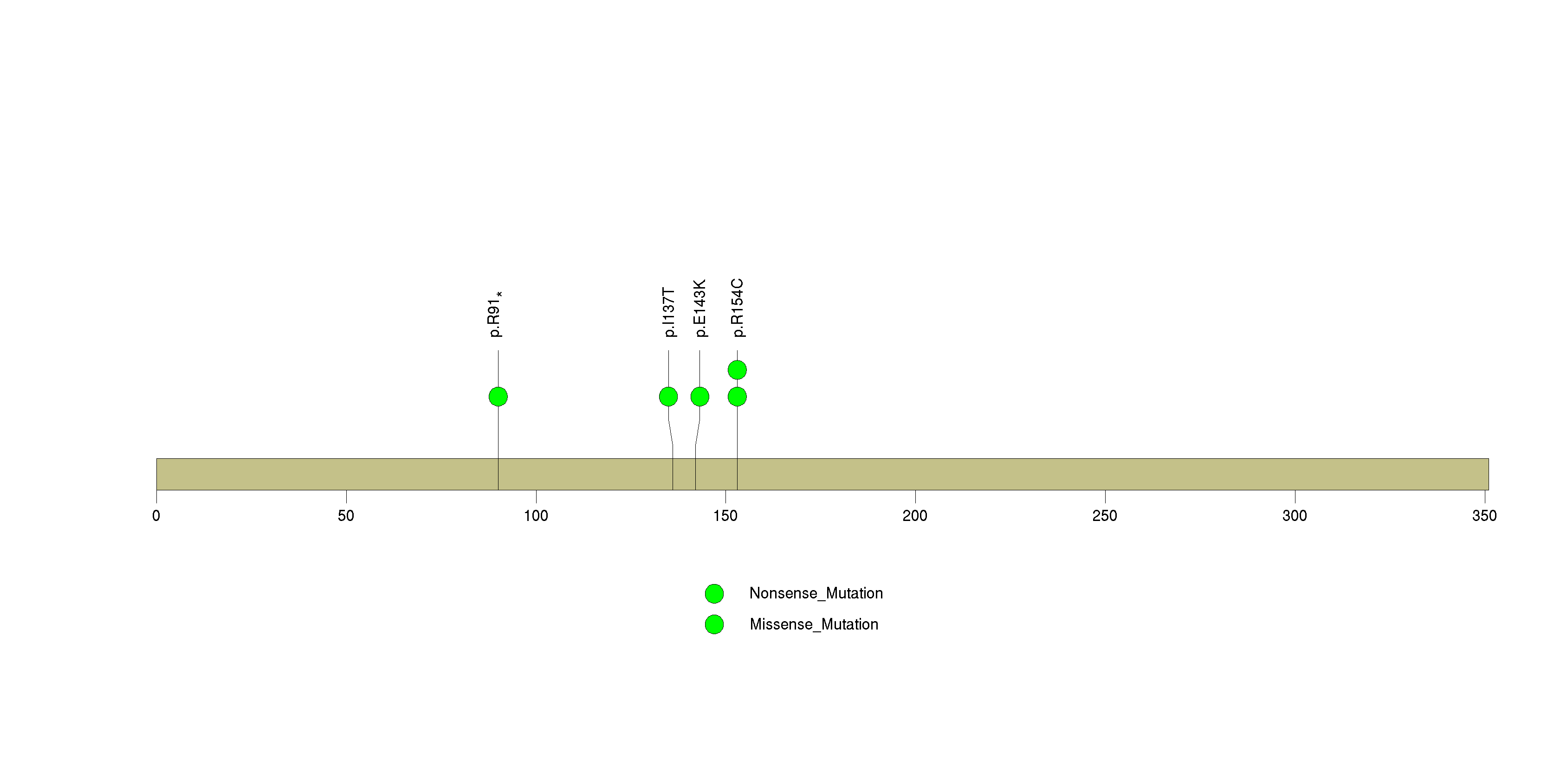
| IDH1 | 293037 | 75660 | 0 | 15 | 15 | 2 | 0 | 0 | 13 | 0.65 | 1.1e-08 | 47 | 0.26 | 0.000023 |
| RPL5 | 212430 | 54417 | 0 | 8 | 8 | 8 | 0 | 0 | 2 | 0.8 | 3.9e-07 | 43 | 0.33 | 0.0007 |
| PRB2 | 256662 | 93411 | 0 | 6 | 6 | 2 | 0 | 0 | 12 | 1.7 | 0.000018 | 37 | 0.26 | 0.029 |
| GABRA6 | 315153 | 89337 | 0 | 11 | 11 | 10 | 1 | 0 | 20 | 0.98 | 0.000024 | 34 | 0.26 | 0.036 |
| QKI | 258408 | 74205 | 0 | 5 | 5 | 5 | 0 | 0 | 12 | 0.3 | 0.000026 | 26 | 0.25 | 0.037 |
| TPTE2 | 372771 | 96903 | 0 | 8 | 8 | 6 | 0 | 0 | 14 | 0.61 | 0.000031 | 33 | 0.26 | 0.04 |
| CD3EAP | 338724 | 107961 | 0 | 3 | 3 | 1 | 0 | 0 | 20 | 0 | 0.000041 | 20 | 0.25 | 0.05 |
| LZTR1 | 510996 | 145791 | 0 | 10 | 10 | 10 | 0 | 0 | 20 | 0.4 | 0.000067 | 33 | 0.26 | 0.077 |
| ZPBP | 221160 | 58782 | 0 | 5 | 5 | 4 | 0 | 0 | 5 | 0 | 0.000081 | 21 | 0.25 | 0.087 |
| TAS2R41 | 206319 | 61983 | 0 | 5 | 4 | 4 | 0 | 0 | 20 | 0.23 | 0.00011 | 20 | 0.24 | 0.11 |
| LCE4A | 68385 | 18624 | 0 | 2 | 2 | 1 | 0 | 0 | 20 | 0.17 | 0.00014 | 14 | 0.19 | 0.13 |
| CDC27 | 566868 | 153357 | 0 | 7 | 6 | 3 | 0 | 0 | 20 | 0.91 | 0.00014 | 35 | 0.26 | 0.13 |
| ZNF697 | 120765 | 31137 | 0 | 3 | 3 | 3 | 0 | 0 | 20 | 0 | 0.00021 | 15 | 0.23 | 0.18 |
| CDKN2C | 113781 | 34629 | 0 | 3 | 3 | 3 | 0 | 0 | 20 | 0.93 | 0.0003 | 20 | 0.25 | 0.24 |
| HIST1H2BE | 84390 | 26190 | 0 | 3 | 3 | 3 | 0 | 0 | 20 | 0.58 | 0.00042 | 17 | 0.24 | 0.33 |
| CYP3A5 | 353274 | 97776 | 0 | 5 | 5 | 5 | 0 | 0 | 20 | 0.21 | 0.00082 | 18 | 0.24 | 0.62 |
| AP3S1 | 162378 | 45105 | 0 | 3 | 3 | 3 | 0 | 0 | 9 | 0 | 0.0012 | 14 | 0.24 | 0.88 |
| ATF7IP2 | 476949 | 125712 | 0 | 5 | 5 | 5 | 0 | 0 | 20 | 0.18 | 0.0013 | 17 | 0.24 | 0.93 |
| SPTA1 | 1721556 | 443775 | 0 | 29 | 27 | 27 | 1 | 0 | 0 | 0.86 | 0.0015 | 69 | 0.27 | 1 |
| ATRX | 1756185 | 433299 | 0 | 17 | 17 | 17 | 2 | 0 | 1 | 1.4 | 0.002 | 72 | 0.28 | 1 |
| PASD1 | 497610 | 133278 | 0 | 5 | 5 | 4 | 0 | 0 | 11 | 0.31 | 0.0025 | 22 | 0.25 | 1 |
| ATG12 | 101268 | 30264 | 0 | 2 | 2 | 2 | 0 | 0 | 8 | 0.34 | 0.0026 | 14 | 0.23 | 1 |
| PSPH | 171690 | 49470 | 0 | 5 | 5 | 3 | 0 | 0 | 19 | 1.1 | 0.0027 | 19 | 0.26 | 1 |
| LRRC55 | 226689 | 71004 | 0 | 6 | 6 | 6 | 1 | 0 | 20 | 0.99 | 0.0029 | 21 | 0.27 | 1 |
| GLIS1 | 320682 | 104760 | 0 | 4 | 4 | 4 | 0 | 0 | 20 | 0.21 | 0.0033 | 17 | 0.24 | 1 |
| DDX5 | 427770 | 116400 | 0 | 4 | 4 | 3 | 0 | 0 | 20 | 0.62 | 0.0035 | 21 | 0.26 | 1 |
| OR5AR1 | 208647 | 60819 | 0 | 7 | 7 | 7 | 0 | 0 | 20 | 1.6 | 0.004 | 21 | 0.25 | 1 |
Figure S1. This figure depicts the distribution of mutations and mutation types across the PIK3CA significant gene.
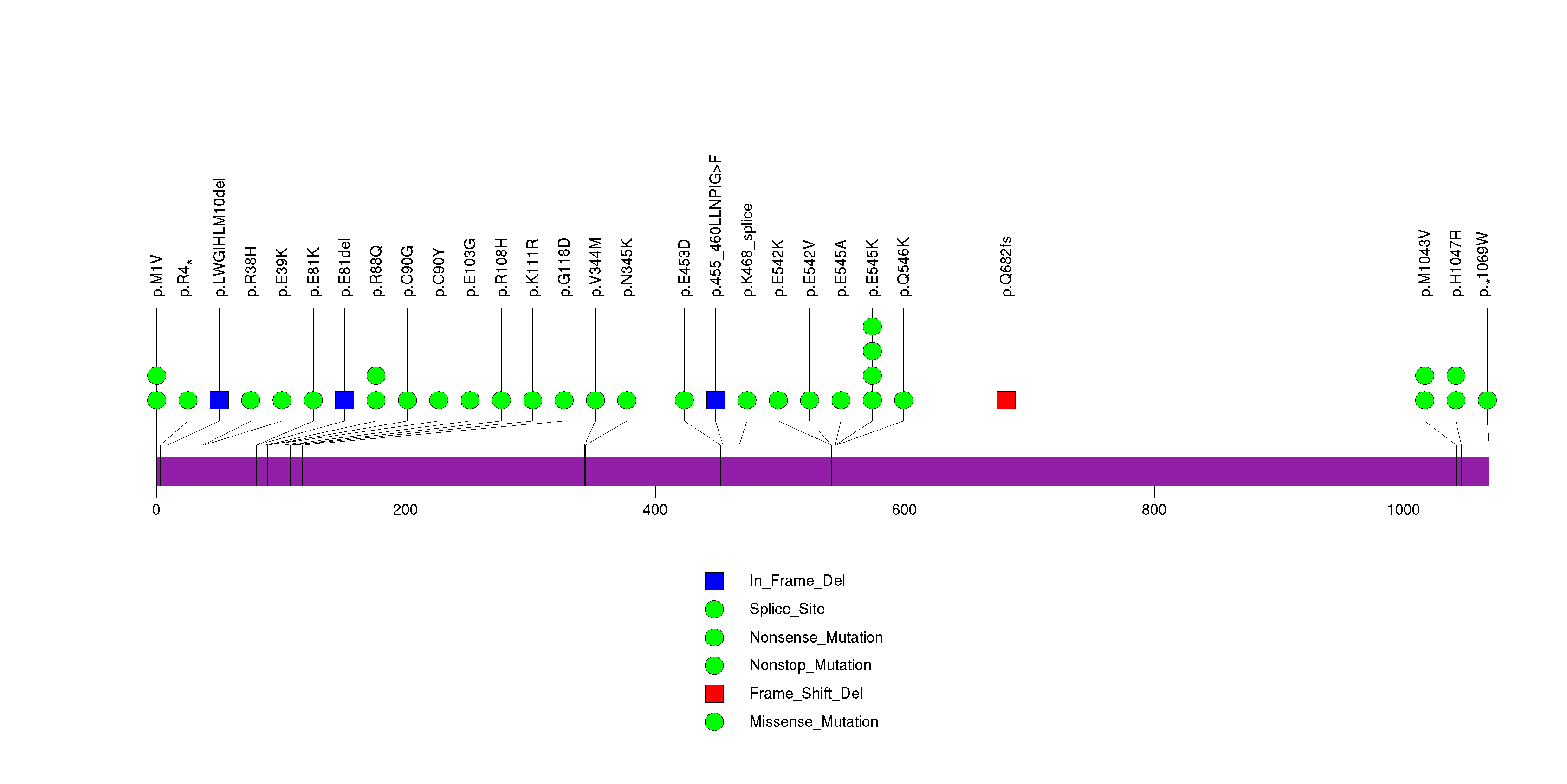
Figure S2. This figure depicts the distribution of mutations and mutation types across the TP53 significant gene.
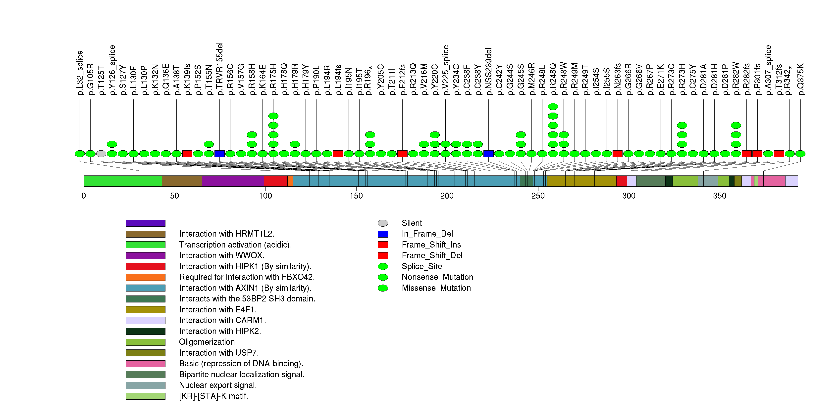
Figure S3. This figure depicts the distribution of mutations and mutation types across the NF1 significant gene.
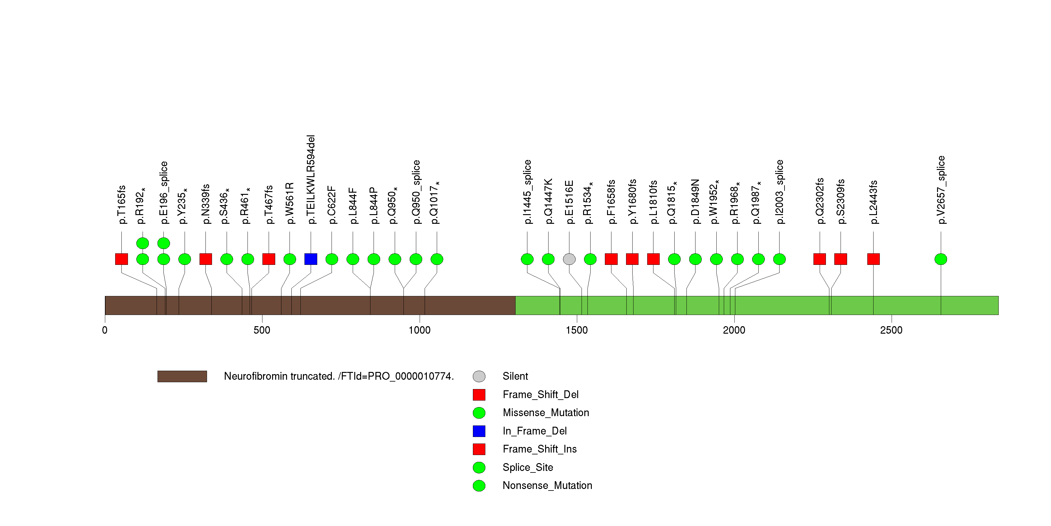
Figure S4. This figure depicts the distribution of mutations and mutation types across the EGFR significant gene.
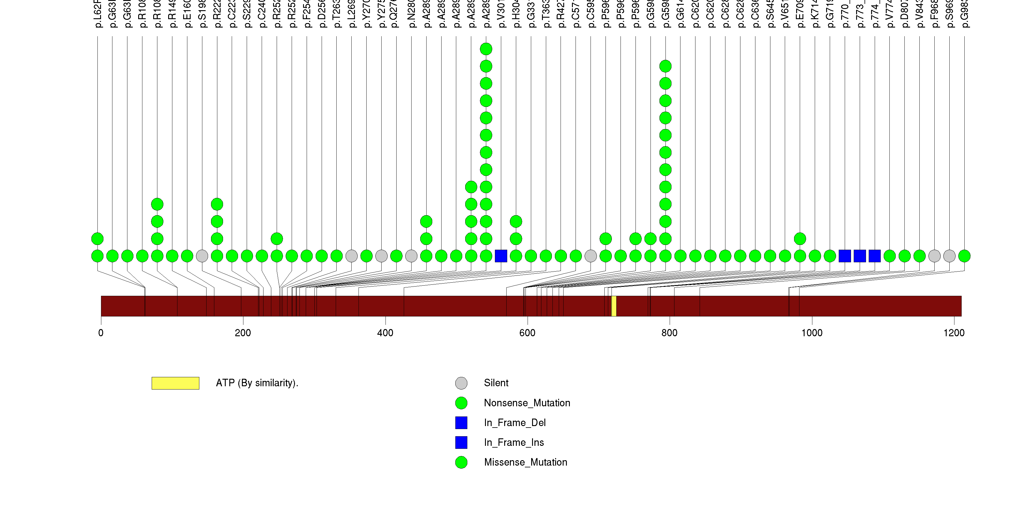
Figure S5. This figure depicts the distribution of mutations and mutation types across the RB1 significant gene.
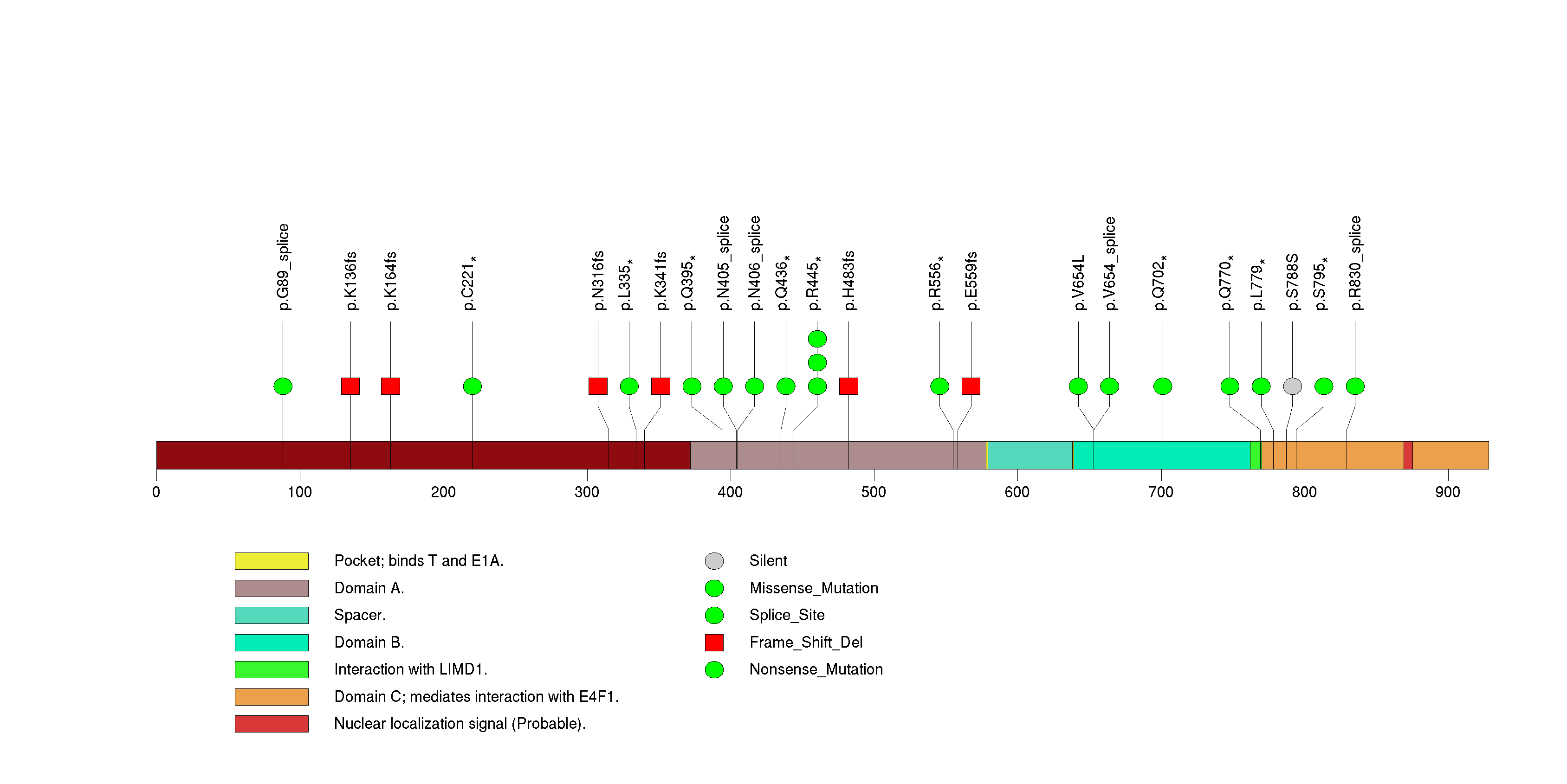
Figure S6. This figure depicts the distribution of mutations and mutation types across the PTEN significant gene.
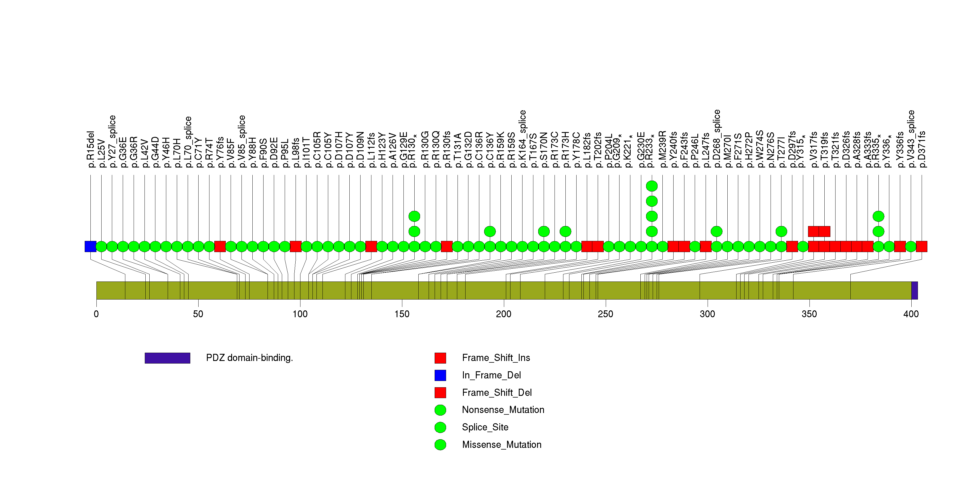
Figure S7. This figure depicts the distribution of mutations and mutation types across the PIK3R1 significant gene.
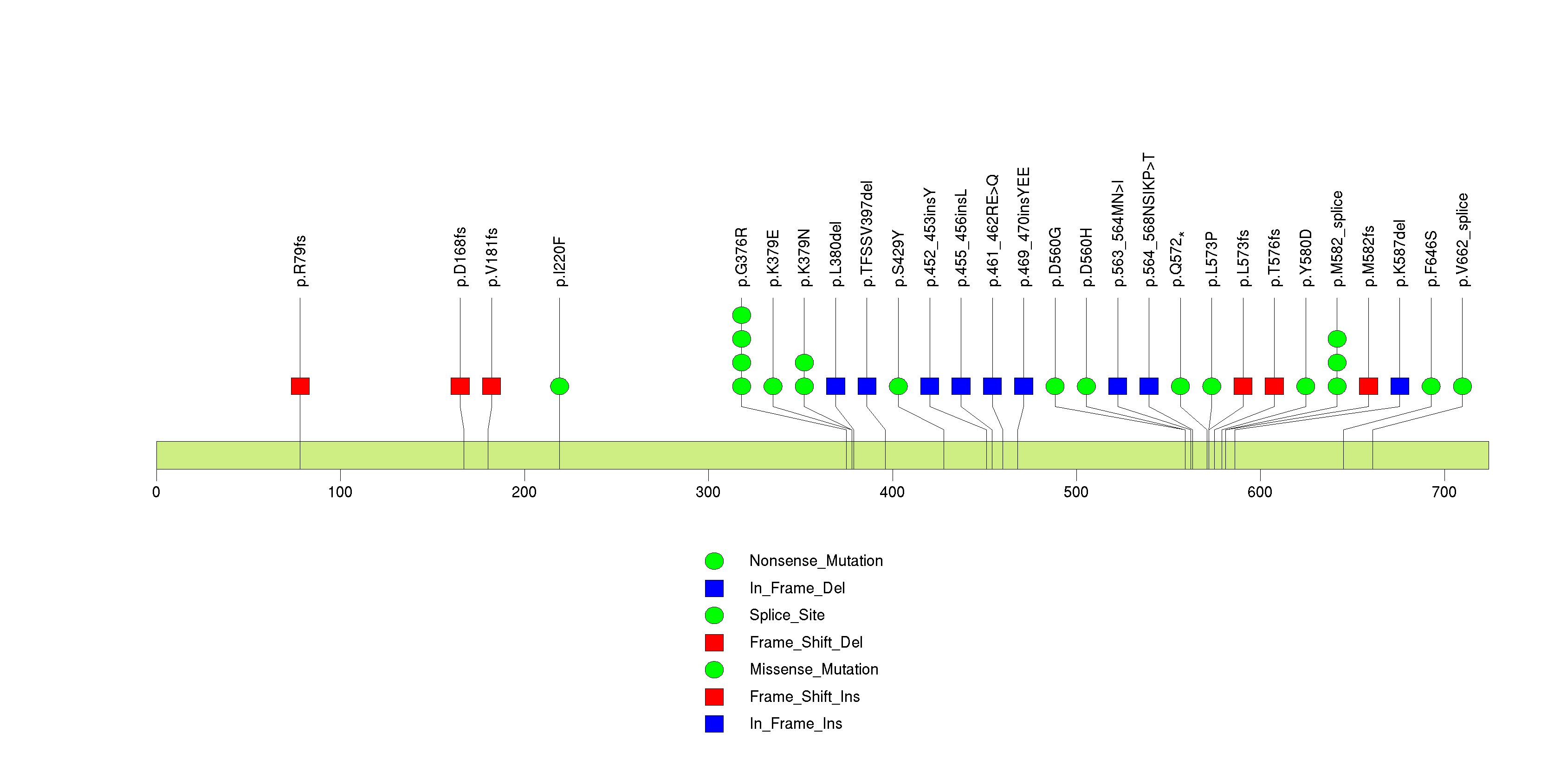
Figure S8. This figure depicts the distribution of mutations and mutation types across the STAG2 significant gene.
Figure S9. This figure depicts the distribution of mutations and mutation types across the IDH1 significant gene.
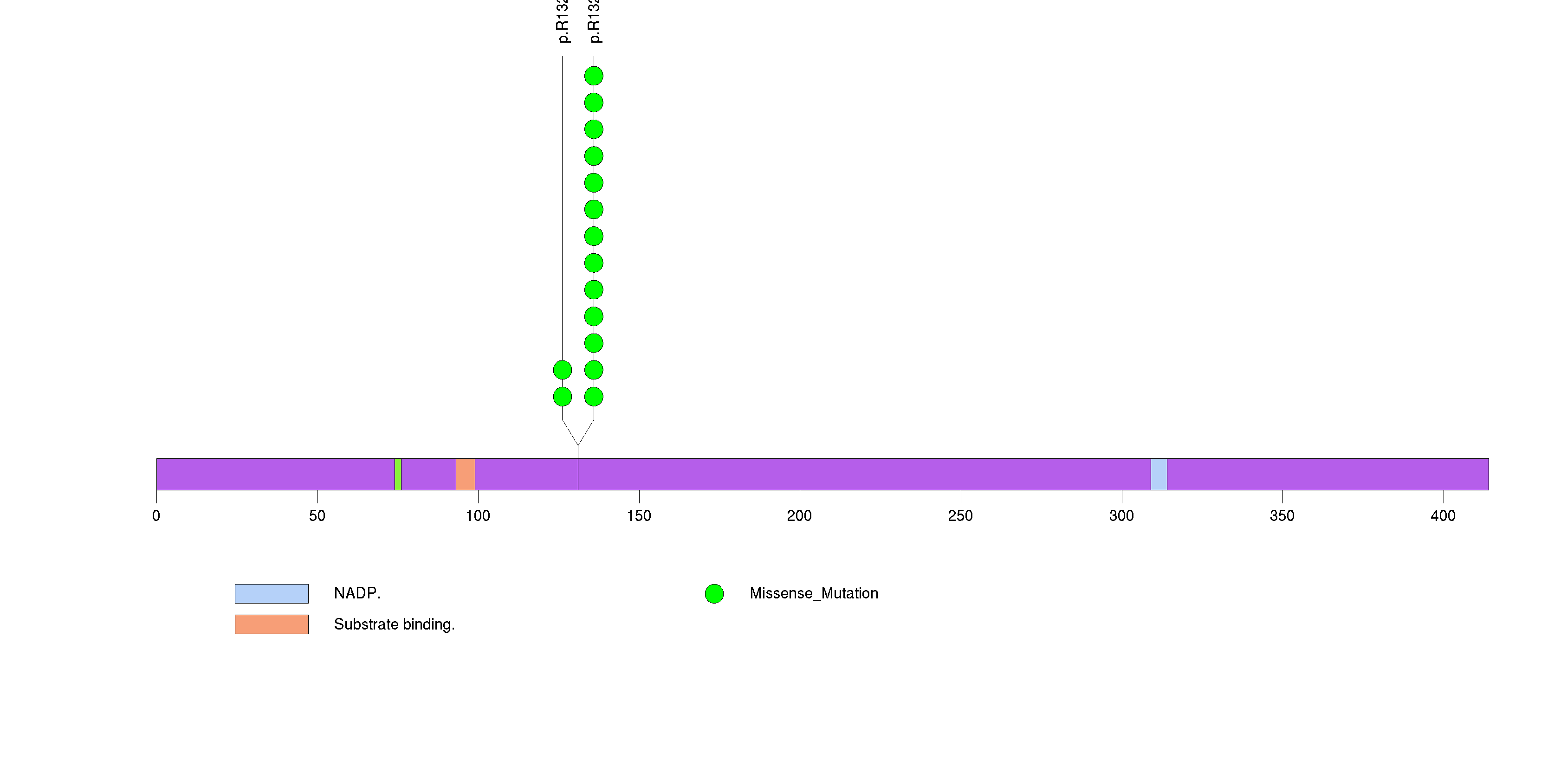
Figure S10. This figure depicts the distribution of mutations and mutation types across the RPL5 significant gene.
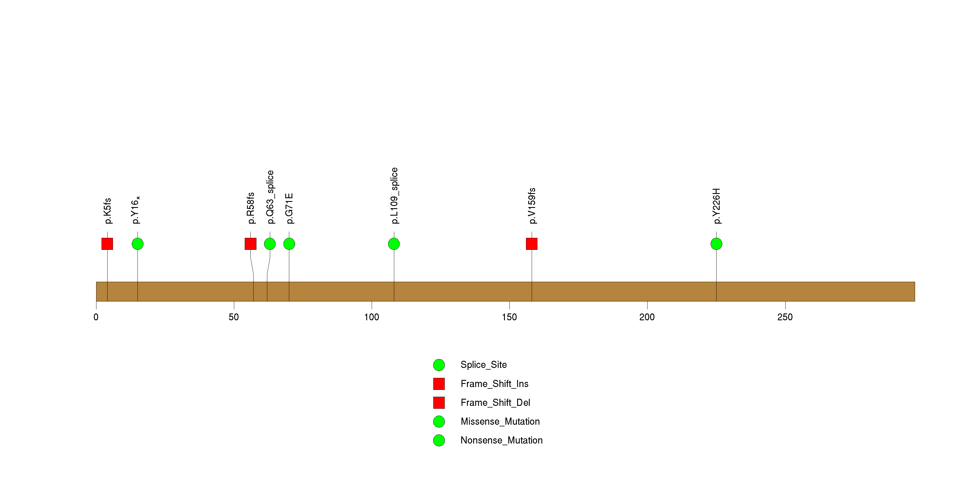
Figure S11. This figure depicts the distribution of mutations and mutation types across the GABRA6 significant gene.
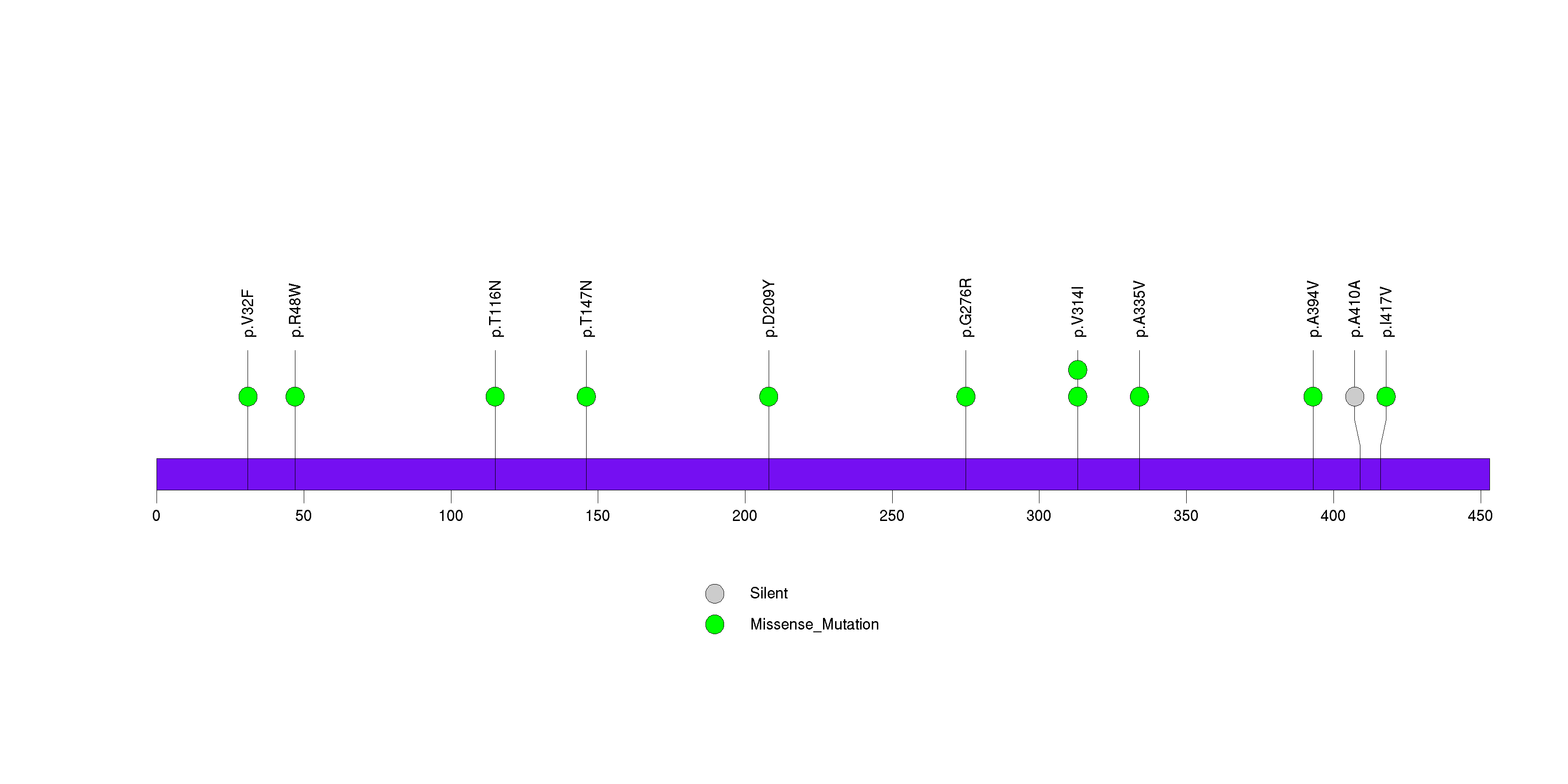
Figure S12. This figure depicts the distribution of mutations and mutation types across the QKI significant gene.
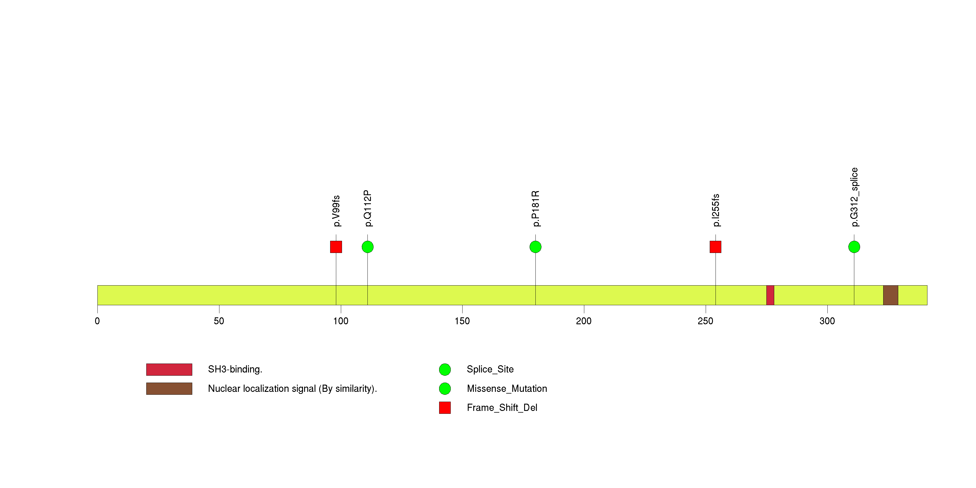
Figure S13. This figure depicts the distribution of mutations and mutation types across the TPTE2 significant gene.
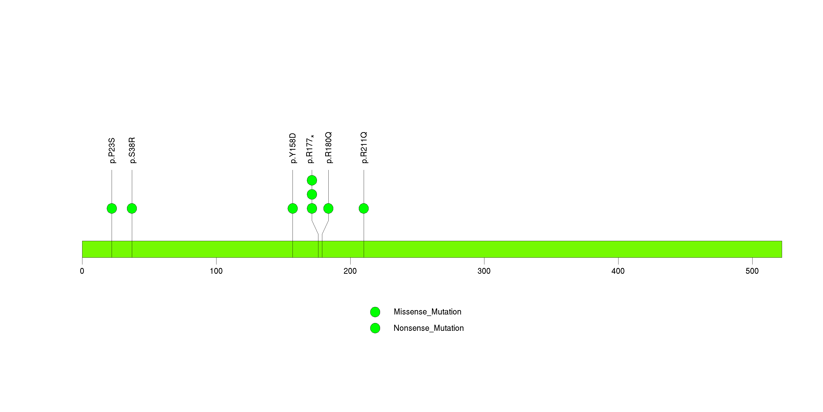
Figure S14. This figure depicts the distribution of mutations and mutation types across the CD3EAP significant gene.
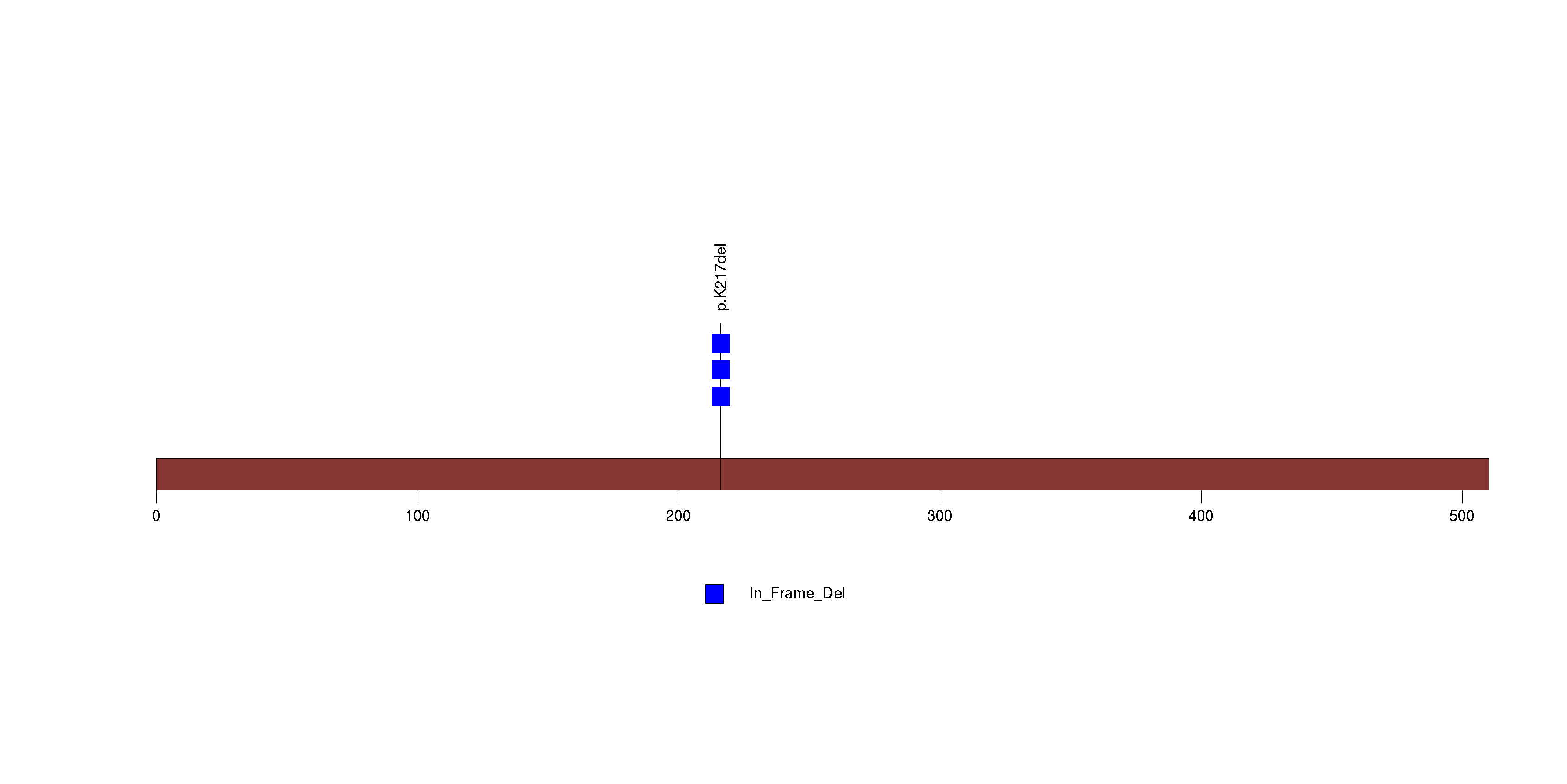
Figure S15. This figure depicts the distribution of mutations and mutation types across the LZTR1 significant gene.
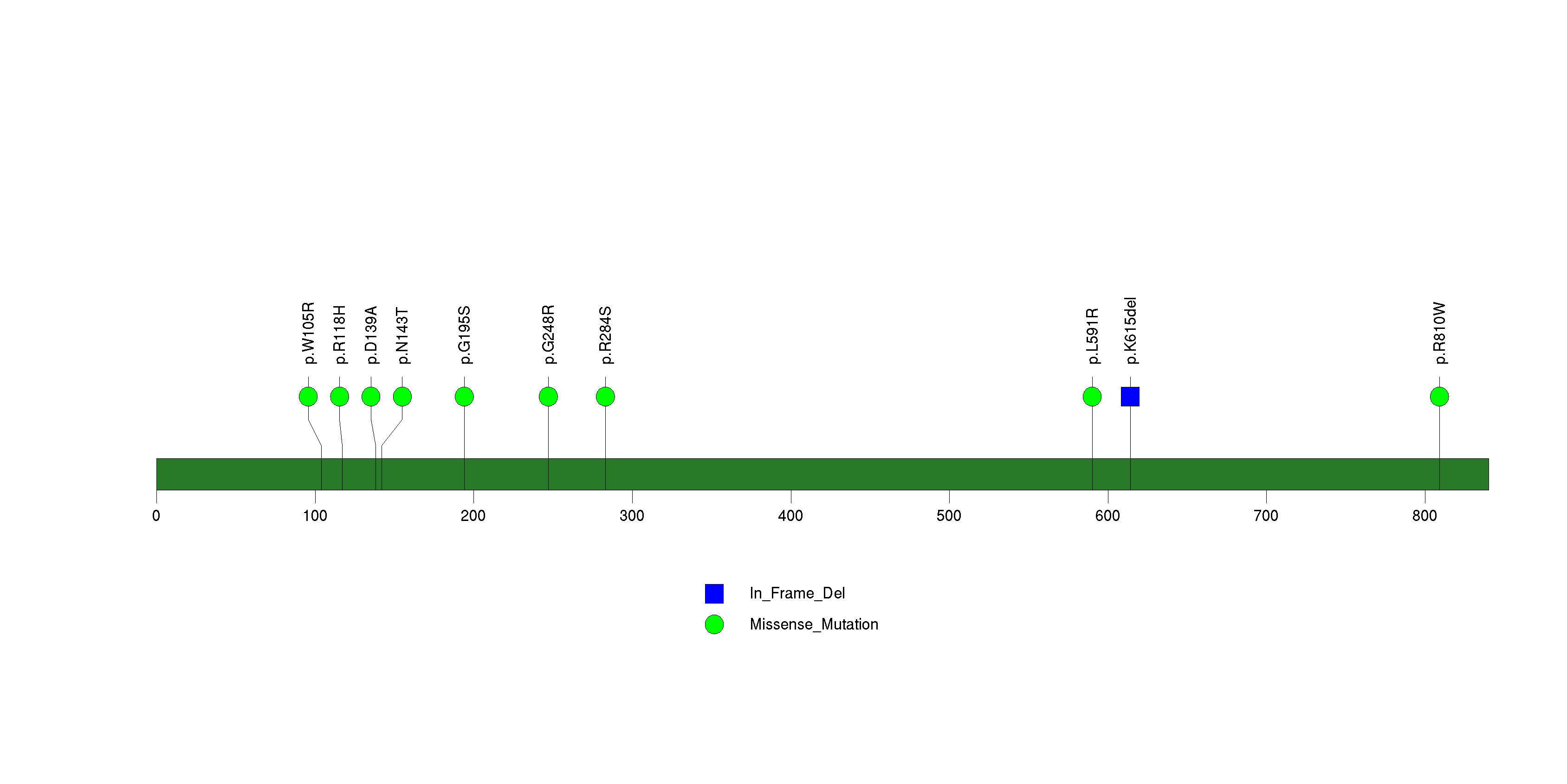
Figure S16. This figure depicts the distribution of mutations and mutation types across the ZPBP significant gene.
In brief, we tabulate the number of mutations and the number of covered bases for each gene. The counts are broken down by mutation context category: four context categories that are discovered by MutSig, and one for indel and 'null' mutations, which include indels, nonsense mutations, splice-site mutations, and non-stop (read-through) mutations. For each gene, we calculate the probability of seeing the observed constellation of mutations, i.e. the product P1 x P2 x ... x Pm, or a more extreme one, given the background mutation rates calculated across the dataset. [1]
This is an experimental feature. The full results of the analysis summarized in this report can be downloaded from the TCGA Data Coordination Center.